THe MOre Store Rebrand
Doing More with Less
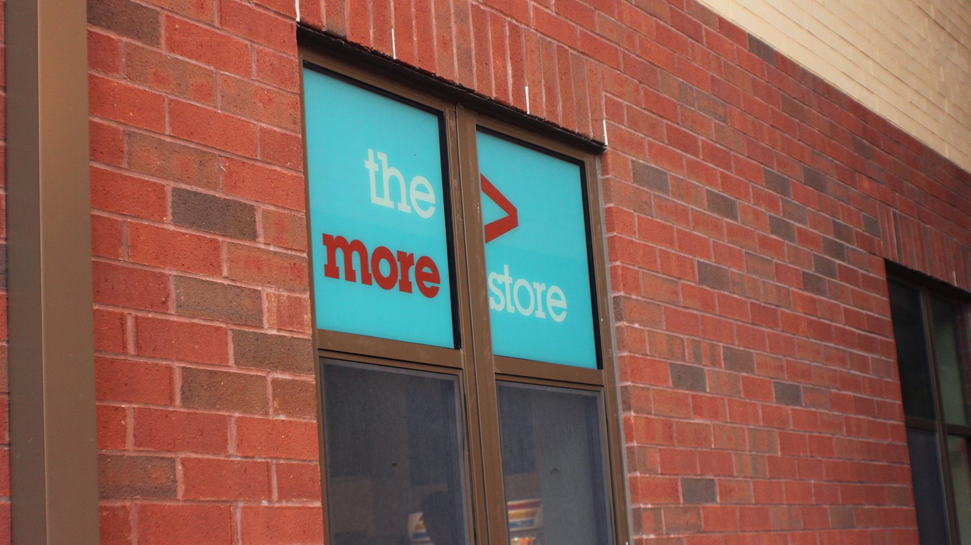
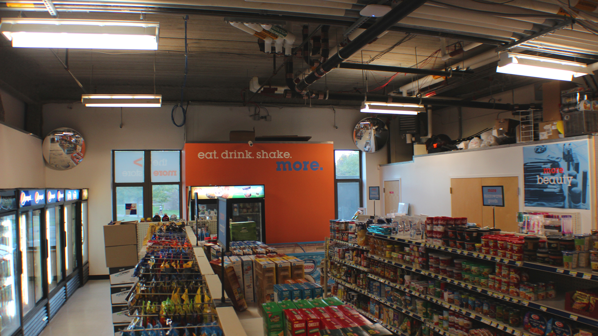
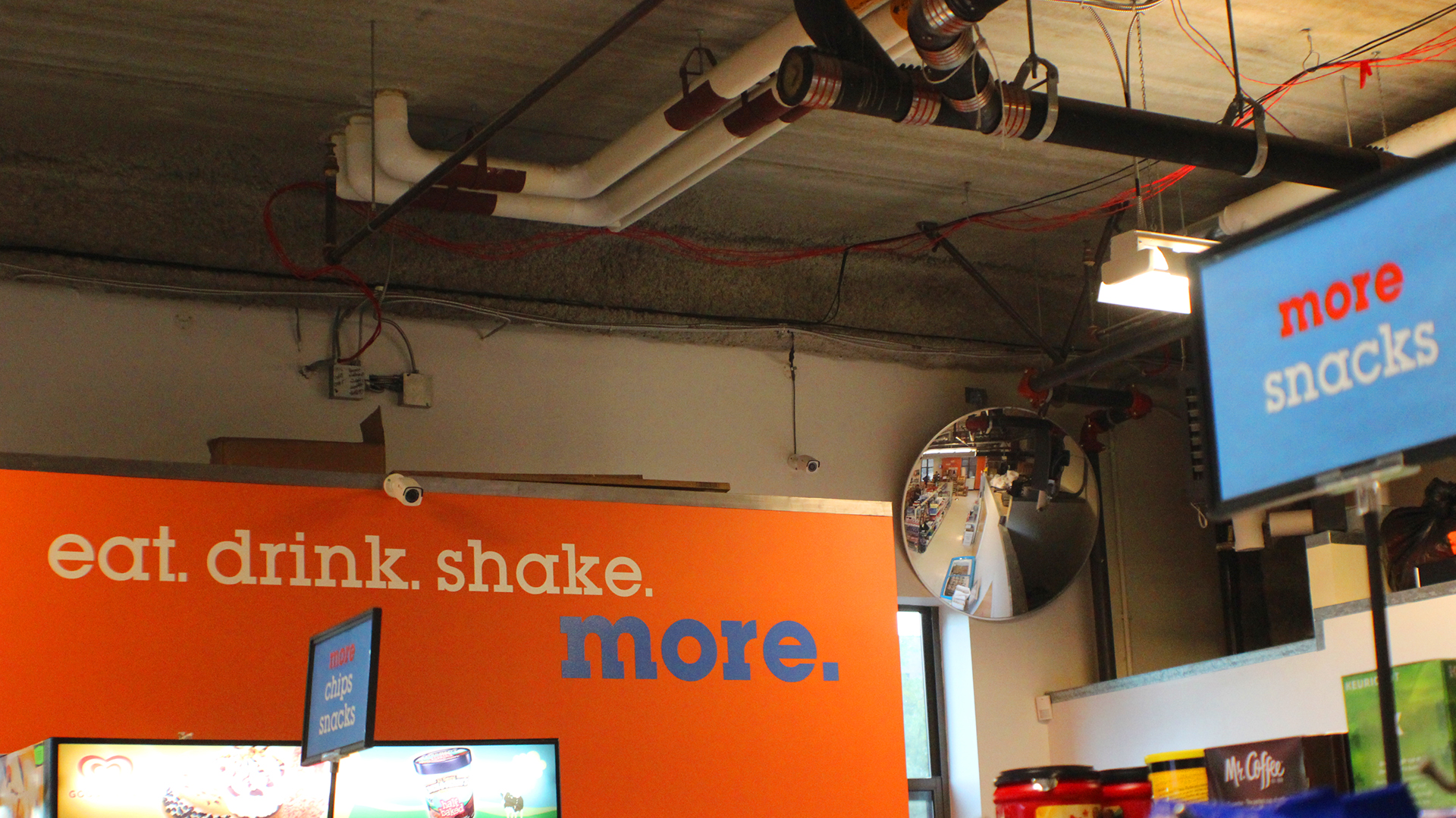
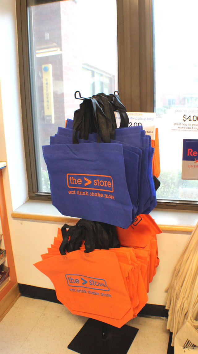
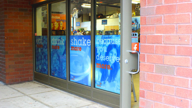
During my junior year at SUNY Purchase, I got an email about the More Store, our school grocery store/ 7-11 Adjacent late night snack place having a rebrand competition. I was still unsure of my design skill at the time but I wanted to see if I can come up with something unique and bold to stand out with the school’s muted colors. I came up with blue as the primary color, and orange as it’s Purchase’s main color. I used ITC Lubalin Graph as the main font and it felt both collegiate and fun, and used a simple more symbol to brand it further. I sent in the PDF with my ideas and won the competition! The work still goes on tote bags and adorns the nametags of all employees. I’m really proud of this project and I hope to get more opportunities to do branding in the future.